The Best Beige Paint Colors: A Designer's Guide to Choosing the Perfect Beige
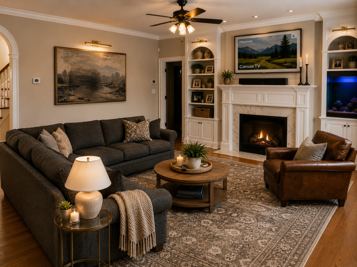
Beige is back, and I couldn't be happier about it!
After years of cool grays dominating interior design, we're seeing a shift toward warmer, softer, and more inviting spaces. Beige is one of my favorite ways to bring that warmth into a home without sacrificing a timeless, classic look.
But before you grab just any beige paint swatch, there's something important to know: not all beige is created equal!
Some shades lean pink, others pull yellow or orange, and some have subtle gray undertones that can make them feel more like a greige. Finding the right beige is all about understanding those undertones and how they work with the finishes already in your home.
Whether you're painting an entire room, updating your kitchen cabinets, or looking for the perfect neutral backdrop, I'm sharing some of my favorite beige paint colors and tips for choosing the right one.
Why Choose Beige Paint?
One of the things I love most about beige is its ability to make a space feel warm and inviting while still maintaining a neutral foundation.
Unlike cooler grays, beige brings a natural warmth that works beautifully with wood tones, stone, linen, and other organic materials.
It's also incredibly versatile! Beige can feel traditional and classic, relaxed and organic, or even elevated and sophisticated depending on the furnishings, finishes, and colors you pair with it.
If you're looking to create a home that feels collected, comfortable, and timeless, beige is a great place to start.
My Favorite Beige Paint Colors
1. Sherwin-Williams Accessible Beige (SW 7036)
Accessible Beige is one of those colors that lives up to its name. It's incredibly versatile and a favorite for homeowners looking for a warm neutral that doesn't feel too yellow or too brown.
Technically, Accessible Beige is more of a greige, blending beige warmth with subtle gray undertones. This balance makes it a beautiful option for homes where you want warmth without going too traditional or golden.
Why I love it:
A beautiful balance of beige and gray.
Warm without feeling overly yellow.
Works beautifully in open-concept spaces.
Pairs well with natural wood, creamy whites, and earthy accents.
Designer tip: Accessible Beige is a great whole-home neutral, especially if you want to move away from cool gray but aren't quite ready to embrace a deeper, warmer beige.

2. Benjamin Moore Pale Oak (OC-20)
If you're looking for a soft, sophisticated neutral, Pale Oak is one of my favorites.
Pale Oak is a light greige with subtle warmth and a beautiful softness. Depending on the lighting, it can appear like a warm beige, a light taupe, or even a soft gray.
It's one of those colors that feels understated and elegant without competing with the other elements in a room.
Why I love it:
Light and airy while still bringing warmth.
Beautiful in traditional and transitional interiors.
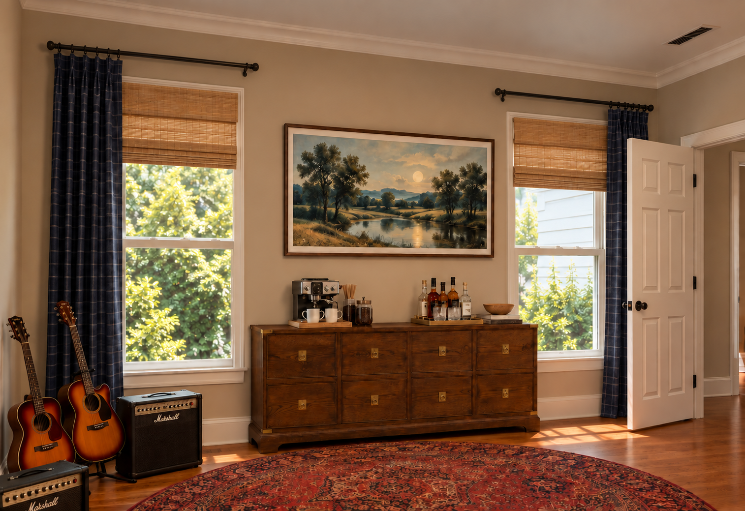
3. Sherwin-Williams Natural Linen (SW 9109)
For a beige that feels warm, relaxed, and effortlessly inviting, Natural Linen is a beautiful option.
This shade has a lovely blend of beige and subtle warmth that creates a soft, organic feel. It's not overly dark or heavy, making it a great choice when you want a room to feel cozy without losing its brightness.
Why I love it:
A warm, soft beige with an organic feel.
Beautiful with natural wood and stone.
Works well in traditional, transitional, and coastal-inspired homes.
Creates a welcoming backdrop for layered textures.
Designer tip: Natural Linen is a great option if you love the look of warm neutrals and want something with a little more personality than a standard off-white.
4. Benjamin Moore Edgecomb Gray (HC-173)
Don't let the name fool you! Edgecomb Gray is a beautiful warm greige that often reads more beige than gray.
It's one of those wonderfully balanced neutrals that can work in so many different spaces. It has enough warmth to keep a room from feeling cold, but it's subtle enough to remain versatile.
Why I love it:
A soft, warm neutral that isn't overly saturated.
Beautiful in living rooms, hallways, and bedrooms.
Pairs well with both warm and cool finishes.
A timeless choice for traditional and transitional homes.
Designer tip: If you're looking for a neutral that bridges the gap between beige and gray, Edgecomb Gray is definitely worth sampling.
5. Sherwin-Williams Kilim Beige (SW 6106)
If you love a more traditional beige, Kilim Beige is a classic worth considering.
This color has a richer, warmer appearance than some of the lighter greiges on this list. It brings a cozy, grounded feeling to a room and looks especially beautiful with traditional furnishings, warm wood tones, and creamy whites.
Why I love it:
A true warm beige with depth.
Creates a cozy, inviting atmosphere.
Beautiful in traditional and classic interiors.
Pairs well with warm woods, leather, and earthy accent colors.
Designer tip: Kilim Beige is a great option if you want to embrace warmer tones rather than simply add a hint of beige to your walls.
6. Benjamin Moore Manchester Tan (HC-81)
For a classic, warm beige that feels timeless, Manchester Tan is another beautiful choice.
It has a natural warmth without feeling as deep or golden as some traditional beige colors. It's a wonderful middle-ground option when you want something warmer than a greige but not quite as dark as a traditional tan.
Why I love it:
A classic, versatile beige.
Warm without being overly heavy.
Beautiful with natural stone and wood finishes.
Works particularly well in traditional and transitional spaces.
Designer tip: Manchester Tan is lovely in rooms with warm flooring and natural materials. Pair it with a soft white trim for a classic, layered look.
How to Choose the Right Beige for Your Home
Choosing beige sounds simple until you start comparing paint samples! Here are a few things I always consider when selecting a neutral for a client.
1. Understand the undertones.
This is probably the most important step!
Beige paint can have yellow, pink, orange, green, or gray undertones. Two beige colors may look nearly identical on a small paint chip but completely different once they're on the wall.
If you have warm wood floors, for example, you'll want to be mindful of choosing a beige that doesn't pull too yellow or orange alongside them.
2. Consider your natural lighting.
Lighting can dramatically change how beige appears.
North-facing rooms tend to have cooler light, which can make beige appear grayer or more muted. South-facing rooms receive warmer light, which can bring out the yellow and golden undertones.
Always look at your samples at different times of the day!
3. Look at your existing finishes.
Before choosing a paint color, consider your flooring, countertops, cabinetry, backsplash, and furniture.
The goal is to create a cohesive palette where all of your finishes work together rather than compete with one another.
4. Think about the feeling you want to create.
Do you want your space to feel light and airy? Consider a softer beige like Pale Oak.
Want something warm and inviting? Natural Linen or Kilim Beige might be a better fit.
Looking for a versatile whole-home neutral? Accessible Beige and Edgecomb Gray are great places to start.
5. Always test your paint samples!
I always recommend sampling a few options before committing to a color.
Paint large sample boards and move them around the room. Look at them next to your flooring, furniture, and other finishes in both natural and artificial lighting.
It's a small step that can make a big difference in the final result.
Final Thoughts: Beige Is Anything But Boring!
Beige doesn't have to mean boring, builder-grade, or outdated. When you choose the right shade, it can be one of the most beautiful and versatile colors in your home.
Whether you gravitate toward the soft sophistication of Pale Oak, the versatility of Accessible Beige, or the warmth of Kilim Beige, there's a beige for nearly every style and space.
My biggest advice? Don't choose a paint color in isolation. The best color is always the one that works with the other elements of your home.
A beautiful home isn't about picking the trendiest paint color. It's about creating a space where every detail feels intentional.
Need help finding the perfect neutral for your home?
At E. Bullister Design, we love helping homeowners bring all the pieces together. From paint selections and finish coordination to full-service interior design, we're here to help you create a home that feels beautiful, comfortable, and uniquely yours.
Let's make your home feel like you!